Share this post
Trip Solutions
4-min read
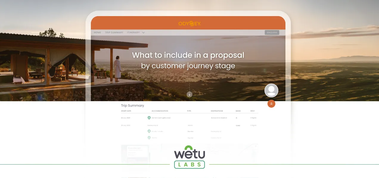
What to include in a travel proposal depends on the customer journey stage
By
Gwenydd Jones
Published
23 April 2026
There’s a moment every travel professional has experienced. You’ve spent hours building a beautiful itinerary with routing, accommodations, inclusions, pricing, terms and conditions, the lot. You send it over to your customer, feeling good about it. And then… silence.
The customer goes cold. Or worse, they come back with objections about things that weren’t even relevant to them yet.
Sound familiar? You’re probably not losing those customers because of your destination knowledge or your product. You may be losing them because of when you’re sharing the information.
The problem with the one-size-fits-all proposal
When someone first reaches out about a trip, they’re in a dream state. They want to feel something: excitement, possibility, the sense that they’re going to embark on a magical experience made just for them. They aren’t ready to scrutinise hotel room categories or wade through travel agency booking conditions.
But by the time they’ve said yes to the package and paid their deposit, the picture changes entirely. Now they want detail. They want to know everything: what to pack, what to expect at the airport, the hotel’s check-in time, emergency contacts. The more, the better.
The problem is that most travel businesses send the same itinerary, with the same information, to customers at every stage of their buying journey. That’s either overwhelming at the start, underwhelming at the end, or both.
What to include in a travel proposal at each stage
Think about your customer journey in three broad phases, each needing you to take a different approach to what you share.
Discovery phase
Your customer has an idea but hasn’t committed. At this stage, your job is to inspire, not inform. Include the highlights, the routing, the key experiences. Make them feel the trip. Keep it visual, keep it brief, and leave them wanting more. The worst thing you can do here is bury the dream in detail.
Quoting phase
Now they’re interested and they want to know what the offer costs. This is where you layer in the pricing, the inclusions and exclusions, and the booking conditions. You’re answering the rational questions that need to be answered before someone commits. The emotion has done its job; now the logic needs to land for them to opt for your trip proposal and make payment.
Travel phase
They’ve paid. They’re going. Now give them everything: accommodation details, contact numbers, daily schedules, destination information, what to expect at every step. This is where thoroughness builds confidence and trust. It also sets you up for a glowing review on the other side.
Same trip. Same client. Three completely different information needs.
Why timing affects conversion
Getting this right isn’t just about a better customer experience, though it absolutely achieves that. It’s about conversion.
When you front-load a proposal with too much detail, you’re asking your client to work rather than dream. You’re turning the fun into a decision too early. Research published in Frontiers in Neuroscience found that when buyers are overloaded with information, they devote fewer cognitive resources to making a decision and take significantly longer to commit.
In a nutshell, sending someone a 40-page itinerary during the discovery phase before they’ve even said “yes, I’m interested” is like putting speed bumps on the path to a sale.
In contrast, a beautifully curated proposal that sparks curiosity and creates desire does your selling for you. It makes the follow-up conversation easier and the quote feel like a natural next step rather than a cold transaction.
Then, when a confirmed traveller reaches the travel phase and receives a comprehensive, well-organised travel document at exactly the right moment, rather than making them feel like you’re giving them homework, you reinforce that they’ve made the right choice. That’s the kind of experience that generates referrals.
How to put this into practice
This is simpler to implement than it sounds, especially if your itinerary tool lets you control what information is visible at each stage without you having to rebuild the itinerary from scratch.
The key principle: build your itinerary once in the platform, with all the detail you’ll ever need, but don’t reveal it all at once. Use the software feature that lets you decide what to reveal, and when, based on the buying phase the customer is in. What they see should always be a deliberate choice you’ve made, not a default.
Think of it less like sending a document and more like telling a story in chapters. Each chapter gives your customer exactly what they need to take the next step, no more, no less.
See these proposal phases in action
In the Trip Designer Wetu Lab session, our team walked through exactly this: showing how to use Discovery Themes to match what your customers see to where they are in their buying journey, all without you having to make changes to the underlying itinerary.
Want to go deeper on Discovery Themes? Check out our article on how to build the Discovery Itinerary your customers will love.
If you’re a Wetu user on a Premium or Enterprise plan, the Theme Customiser is already available to you. It’s worth setting up three core themes, one for each stage, and seeing how that changes how your customers respond. It’s simple to do and you’ll see fewer confused questions early on, faster progression to a quote, and fewer proposals going quiet.
Not using Wetu yet?
Start your free trial and see how it works for yourself. Choose the option for tour operators, DMCs, and travel agents.
Wetu Labs run monthly across two tracks: Trip Designer and Supplier Studio. Fill in the Wetu Labs sign-up form to join the next session.
Trip Solutions

Blog
Keep the inspiration flowing
Explore related stories, tips, and updates to help you bring magic to your clients.